Introduced by Richard Danne (Design Director) and Bruce Blackburn (Designer) at Danne & Blackburn, New York, in 1976 is there anything cooler or geekier than this?!
The agency switched to the modernist NASA logotype, nicknamed “the worm”, a stylized rendering of the letters. The A’s horizontal crossbar is removed in the worm logo.
NASA Administrator Richard Truly stated:
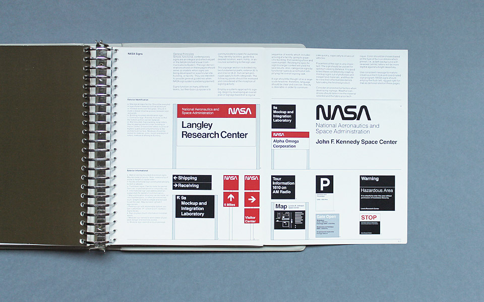
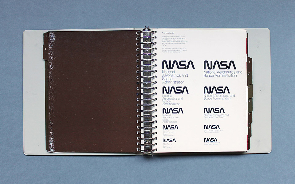
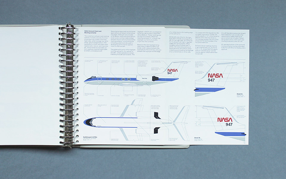
“We have adopted a new system of graphics-the visual communications system by which we are known to those who read our publications, see our vehicle markings and signboards and the logotype that unmistakably brands them as NASA’s”.
The NASA typeface was officially dropped in 1992, personally I feel it’s a bit of a backward step.
You can read more about it on the Display website and checkout more spreads on flikr.